WebGL Globe
•
Created by the Google Data Arts Team
•
Data acquired from
IAEA
and
The Guardian
•
Visualization by
Mapping & Co
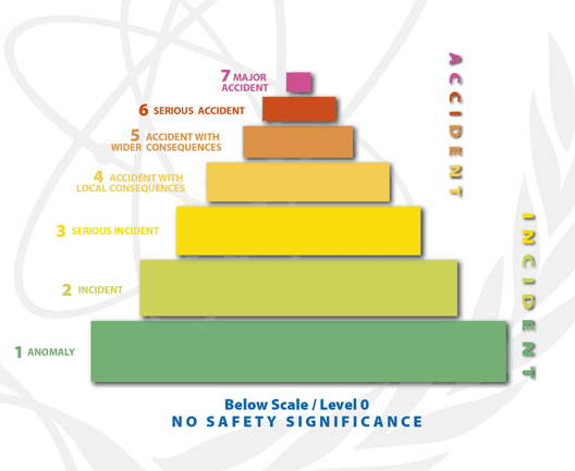
The size of the bar represent the number of Reactors, and the color represents if that plant has ever had an accident, level is based on the
International Nuclear Events Scale.
Nuclear Power Stations worldwide
This is a Chrome Experiment